
UpAway
'UpAway' is an all-in-one mobile app for all users’ travel planning needs and acts as both a travel planning app and a communication center.How it Started
-
UX Researcher & Designer
Working solo, this was my very first project during the UX/UI Design boot camp I just finished.
I was tasked with building a modern-day mobile app that helps people plan their next trip, post-pandemic.
-
Figma, FigJam, Miro, Canva, Adobe
-
The timeline was set for a period of 4 weeks.
Phase 1: Research
The Problem
Through research, I observed that other services aren’t meeting users’ trip planning needs in totality, or their time-frame expectations, which is causing them to postpone or end the planning process altogether. Research & Analysis
I conducted 5, 1 on 1 user interviews. From the user interviews, I extracted the common responses across participants, which led to my key takeaways. I did the same with the answers from the survey.Target users: Individuals who are planning trips
Age range: 29-40 years old

User Interview Takeaways:
“The biggest pain point for me is trying to get all the information together in a very short amount of time, because a lot of times you're trying to work out the details, by the time you come back to book everything the prices have already changed.”“I need it to kind of be fast paced. I don't want to read too much. I don't want to watch too long. So, I need to get as much information in as little amount of time as possible.”“I dislike not having a one-stop shop, as the trip planning process is too time consuming and disjointed.”“The ideal trip planning process would be somebody else planning it for me.”
Proto Persona
I started with imagining who would use this all-in-one travel planning app, and created a proto persona named Stacy Swartz. Stacy is a free-spirited 18-year-old college student, majoring in education.
Goals: to create new memories and bond with friends, affordable travelNeeds: local activities and social events when travelingDislikes: going over budget and a trip that is more work than is fun

Phase 2: Brainstorm & Ideation
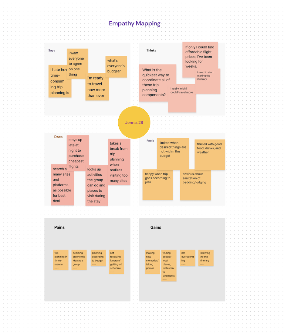
The User Thinks: “What is the quickest way to coordinate all of these trip planning components?”. Empathy Map:
Next, I did an Empathy Map to help develop my final persona, the user persona. I created a few ideas for what the potential user would say, think, do, and feel. The user says: “I hate how time-consuming trip planning is.”The user thinks: “What is the quickest way to coordinate all of these trip planning components?”The user does: "Look up activities the group can do and places to visit during the stay."The user feels: "Happy when the trip goes according to plan."
Key Takeaways
Travelers…Prefer group travelHave goals to explore/be activeEnjoy itinerariesPrefer apps/sites that are simple/easy to navigateDislike planning various trip components on different platforms (lodging, flight, car rental, activities)Travel more, post-pandemic, than they did prior/during
Affinity Diagram
Using my proto persona and user interview responses as guides, I began to brainstorm the needs and wants of potential users and how that would translate in my design. I started by putting user interview responses on FigJam sticky notes and grouping them by common themes to create an Affinity Diagram. The common themes I noticed were trip goals, tools, pain points, and post pandemic needs.

User Persona:
From the research and Empathy Map, came the final persona, the user persona:
initiating different trip planning components
Jenna Richards
Jenna is a writer and editor, the leader of her friends’ group chat, and is always looking to organize the next group outing or trip.Needs: for the trip to be affordable and unforgettableLikes: reading, art and entertainmentGoals: to experience different cultures and destinationsDislikes: coordinating different trip planning components

I Like, I Wish, What if:
With the user persona, Jenna, as my guide, I then used the "I Like, I Wish, What if'' method to imagine what the ideal UI design would be for UpAway app users.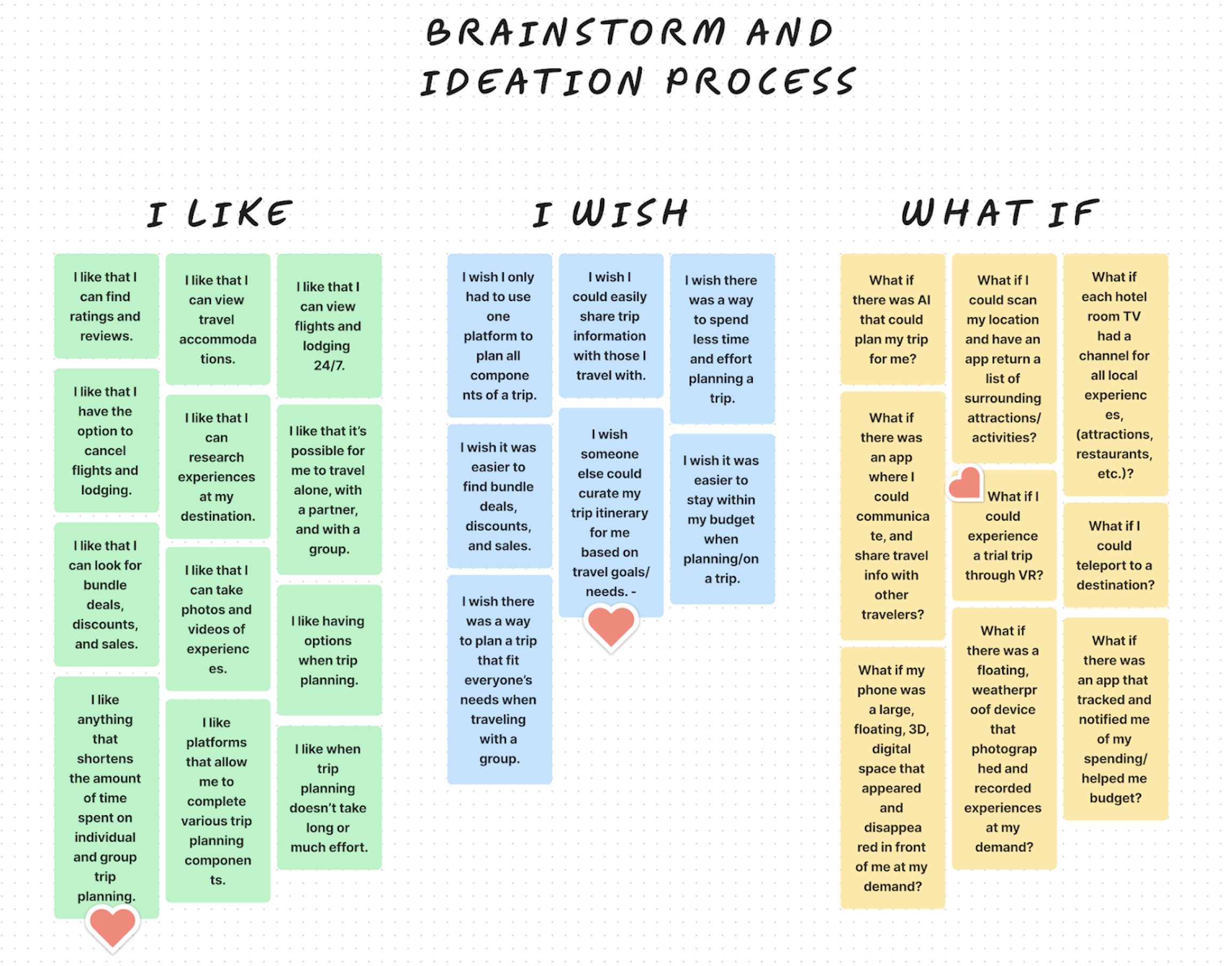
Feature Prioritization Matrix
I came up with a few responses for each category, "I Like" "I Wish" "What if" and then organized this brainstorm using the Feature Prioritization Matrix, to group and categorize the ideas leading up to the design phase. I put each imagined response into its respective section: low effort/low impact; high effort/low impact; high impact/low effort; high impact/high effort.
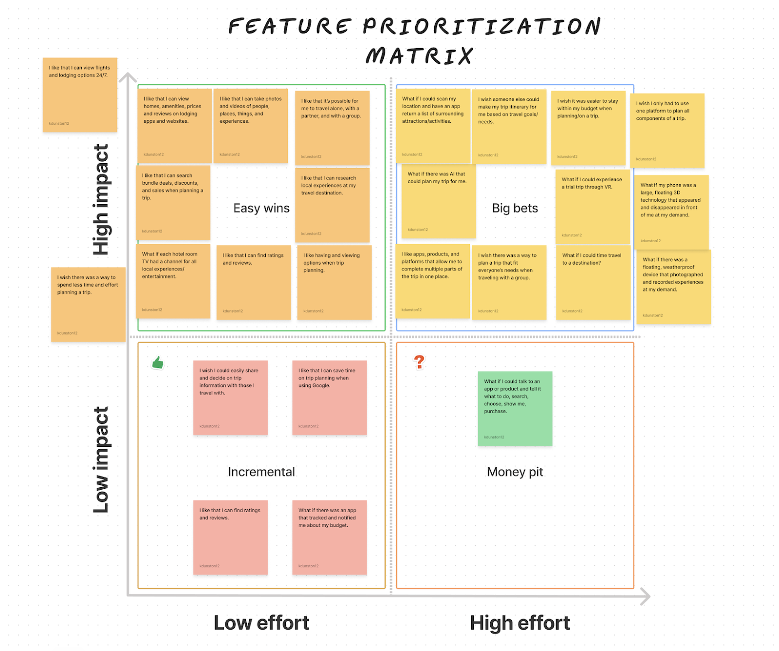
Key Takeaways:
I then voted on the top answer from each category, according to what I felt was most important for the website's UI and the user's experience:Travelers... 1. Like: “Things that shorten the amount of time spent on individual and group trip planning.”2. Wish: “Someone else could curate the trip itinerary for me based on travel goals/needs.”3. Think “What if”: “I could experience a trial trip through VR?”
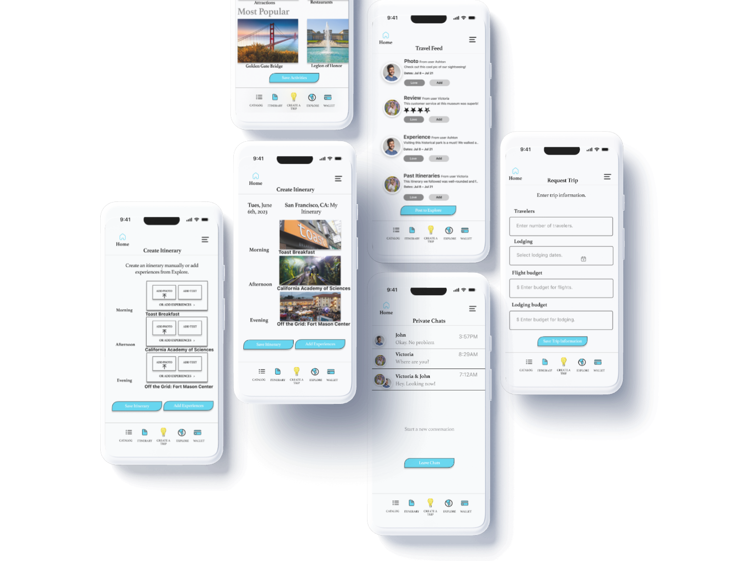
I used the top 3 as a guide for the app’s final features list.After discovering people travel the same amount or more post-pandemic and prioritize spending minimal time and using minimal tools and platforms when trip planning, I decided on the final features for the app.Using the research, brainstorming, and ideation, i determined the final features list would be:FlightsLodgingCreate ItineraryRequest ItineraryTravel FeedPrivate Single and Group Chats
Phase 3: Wireframing
User Flow, Sketches, and Lo-Fi WireframesHere’s the user flow or the steps users would take when using the app:Here are the sketches I drew:Here is the low-fidelity prototype I created: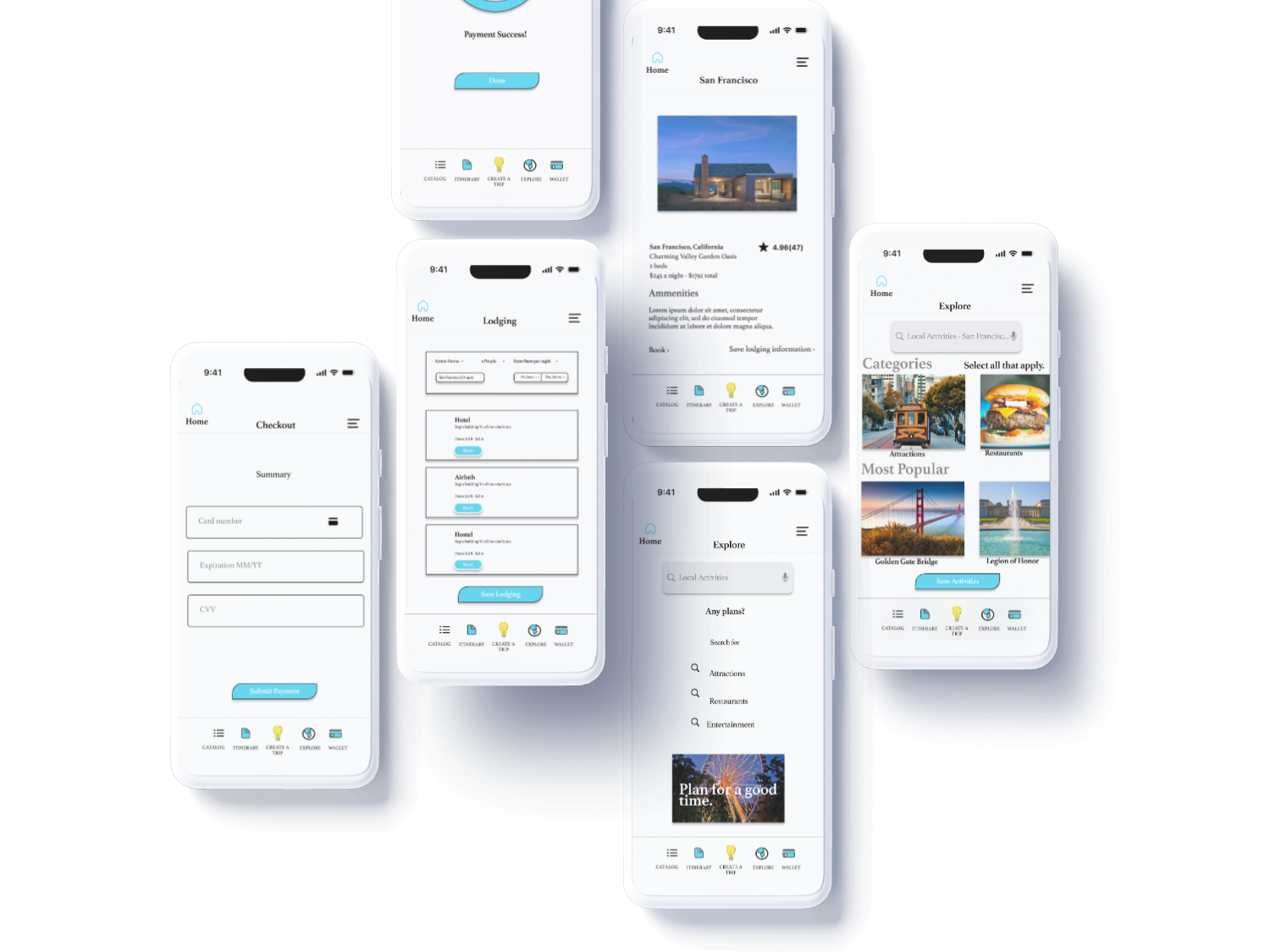
Phase 4: User Testing & Outcomes
Insights:
Here’s the user flow or the steps users would take when using the app:
Here are the sketches I drew:
Here is the low-fidelity prototype I created:
Phase 5: The Prototype
The Solution: UpAway
“For all of your travel planning woes.”

Figma Prototype Link: